好的交互设计可以区分开有质量的网站和其他普通网站。然而,如果有明显的设计错误,它只会给予你本来想打动的用户以刺激和挫败感。下面是Speckyboy上总结的让人最不喜欢的交互设计错误列表,来看看你中枪了没!
Interaction design can separate the quality sites from the rest of the crowd – if done well. If, however, there are glaring errors in the designs, it will only serve to irritate and frustrate the very people you’re trying to impress.
Here’s a list of my least favorite IxD mistakes that have left users disappointed, confused, and can even at times leave them a little angry.
缺乏对比(Lack of Contrast)
译文:当浏览网站时,我们喜欢看页面设计展示出干净、清爽的对比。对比达到了一个重要的目的——它使内容可读,并毫不费力地在页面上指导用户。这是一个最基本的设计概念,只是很奇怪,有些网站似乎就是不明白。
没有足够的对比度的话,不管是颜色或整体展示,一个网站看起来,在最好的情况下,也会让你觉得有点儿丈二和尚摸不着头脑,在最坏的情况下,将会使页面完全不可读。
When browsing sites, we like to view designs that pop off the page with clean, crisp contrast. Contrast serves an important purpose – it helps make the content readable, and effortlessly guides users around the page. This is one of the most basic design concepts, and it’s surprising that some sites just don’t seem to get it!
Without enough contrast, either in the color palette or overall presentation, a site can look, at best, a little confusing; and at worst, unreadable.
Interaction Design Mistake Example: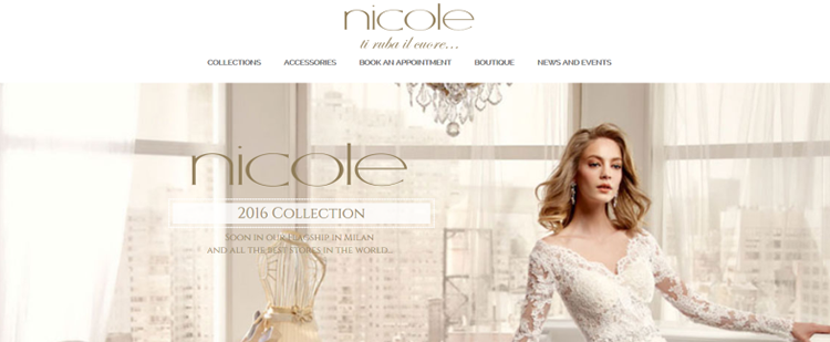
疯狂的导航(Insane Navigation)
无论你用的是什么跳出框架的导航创意,先考虑好你的用户。这并不是令人无聊的,而是深思熟虑并且务实的。好好利用导航设计的最佳实践和原则:清晰、简单性、一致性和相关性。
No matter how out-of-the-box your navigation ideas are, think of your users first. It’s not being boring. It’s being thoughtful and pragmatic. Take advantage of navigation design best practices and principles: clarity, simplicity, consistency and correlation.
Interaction Design Mistake Example:
非响应式的或者不良的触摸目标(Non-Responsive & Poor Touch Targets)
响应式网站在现在是至关重要的,我们没有借口去创建一个在你的智能手机上很难用的网站,除非你做了大量的用户测试,并证明了一个移动友好的网站并不是必需的
Responsive websites are vital these days, and there’s no excuse for creating a site that’s hard to use on your smartphone unless you’ve done tons of user tests and proven that a mobile-friendly site is not a necessity.
Interaction Design Mistake Example: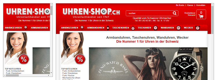
令人心烦意乱的音乐(Mind-Numbing Music)
在晚上放些音乐很高兴而且也令放松。在正确的时间点上,音乐可以是很棒的体验。然而,在99.9%的情况下,正确的时间并不是当你浏览网站的时候。
很少有事情比你在浏览一个网站的同时有一个刺耳的管弦交响乐团在你耳边演奏更恼人的事情。如果你是广告你的下一张专辑,这可能还算是可以原谅的。但即使这样,也只是可能还算是。
It’s nice to put on some music in the evening and relax. Music can be great, at the right times. However, in 99.9% of cases, the right time isn’t when you’re browsing online.
Few things are more annoying than browsing a site and having an orchestral symphony blaring in your ear at the same time. It’s possibly just about excusable if you’re advertising your next album. But even then, only just.
Interaction Design Mistake Example: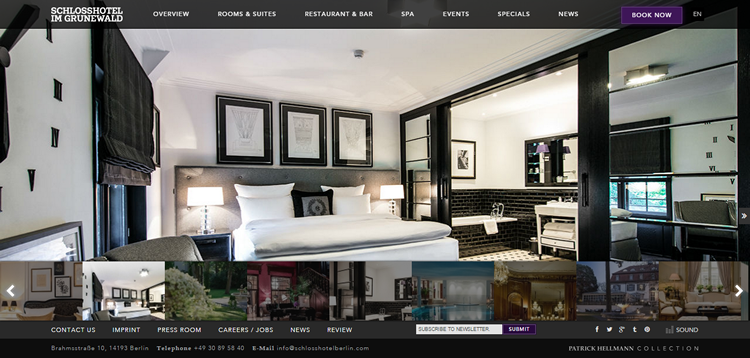
毫无意义的弹出窗口(Pointless Pop-Ups)
是的,弹出窗口真的可以让人感到恼火。特别是注册窗口!每个人都需要更多的注册!但是,总有更好的方法来做你的营销。弹出式窗口可以像冲孩子大喊大叫以试图吸引其注意力一样恼人。如果你必须使用弹窗,请让它们简单,有创意,并且易于关闭。
Yes, they can really be irritating. Sign-ups! Everyone needs more sign-ups! However, there’s always a more elegant way to do your marketing. Pop-ups can be about as annoying as shouting children trying to get your attention. If you must use them, keep them simple, creative, and easy to shut down.
Interaction Design Mistake Example: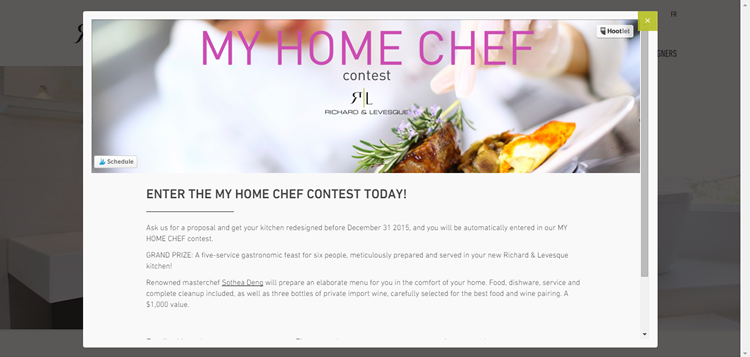
可怜的架构(Poor Structure)
我理解尝试创新是多么诱人。毕竟,你希望你的设计脱颖而出。然而,当创造变成了一场火热的混乱,就是时候带入一些必要的组织性。
伟大的设计师们都是伟大的沟通者。视觉层次结构和平衡是创造良好的第一印象的重要层面,同时它们可以影响用户的行为,更重要的是,可以有效地传递出网页以外的信息。
I understand how tempting it is to try to be creative. After all, you want your design to stand out. However, when creativity just becomes one hot mess, it’s time to bring in some much needed organization instead.
Great designers are great communicators. Visual hierarchy and balance are some of the important aspects of creating a good first impression, shaping user behavior, and more importantly, effectively delivering the message beyond a web page.
Interaction Design Mistake Example:
棘手的排版(Tricky Typography)
当我访问网站,我喜欢能够快速而方便地访问信息。我们都不喜欢混乱的不易阅读的带阴影效果的大号字体。或者是在一个移动的背景尝试阅读,或者与要用放大镜才能查看的小字体苦苦斗争。
这里有一些可以帮助你复习基础知识的规则:
—— 建立一个清晰的层次结构
—— 注意文本对齐方式
—— 限制字体的字号数量、类型和颜色
—— 必要时充分地利用空白
When I visit websites, I like to be able to access information quickly and easily. We’re not keen on confusing large lettering with difficult-to-read shadow effects. Trying to read words over a moving background, or struggling with teeny-tiny fonts that require a magnifying glass to view them.
Here are a few rules to help you brush up on the basics:
Build a clear hierarchy.
Pay attention to text alignment.
Limit the number of font sizes, types, and colors.
Make good use of whitespace where and when necessary.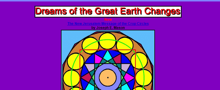
笨拙的表单(Clumsy Forms)
有的时候你会需要向你的用户要一些信息,这本身很好。然而,这并不是说你可以为他们提供一个很长,很浪费时间的表单。重复地要求相同的信息也不是一个好主意。只向用户要最少量的必要信息,并且不要忽视表单的跨浏览器样式。
好的表单交互体验来自于清晰性、简洁性和一致性。
这里有一些小贴士:
—— 强调需要的字段
—— 必要时显示进度
—— 提供提示
—— 注意字段的长度
—— 使用先进的工具来定制表单元素
There may be times when you need to ask your users for information, and that’s fine. However, it’s not okay to present them with a form that’s overly long and far too time-consuming to complete. Nor is it a good idea to ask for the same information twice. Ask for exactly what you require, at a minimum, and don’t neglect cross-browser form styling.
Great web form interaction experience comes from clarity, conciseness, and consistency.
Here are a few tips:
Highlight required fields.
Display progress if necessary.
Provide hints.
Pay attention to field length.
Use advanced tools for customizing form elements.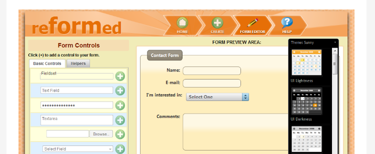
没有用户反馈和数据的抄袭(Copying Others, Without User Feedback & Data)
从别人那里获得灵感并不一定是件坏事,但如果你这样做,你需要确保你手头有正确的反馈和数据,以确保你在为你的目标受众提供真正的设计价值。
It’s not necessarily a bad thing to take inspiration from someone else, but you need to ensure you’ve got the right feedback and data at your fingertips before you do so to make sure you’re designing something of genuine value for your target audience.
Interaction Design Mistake Example: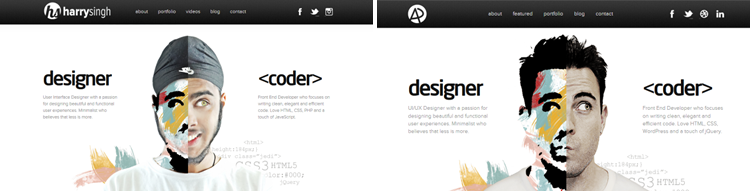
显著的不一致性(Glaring Inconsistencies)
在一定程度上风格可以混搭的。然而,如果整体效果成了一个巨大的,丑陋的视觉“冲突”,那么还是建议回到绘图板并重新开始。
好的交互设计是具有一致性的。它使用户更好地理解事物是如何工作的,让用户在使用一个网页时,感觉到他们在控制局面,以及提高他们的工作效率。雅各布·尼尔森说:“用户的期望更多地被证实是正确的,他们就会越觉得他们在控制系统,并会更加喜欢它。”
It’s ok to mix-and-match styles to a certain extent. However, if the overall effect is just one big, ugly visual “clash” then it’s advisable to get back to the drawing board and start over.
Great IxD is consistent. It gives users a better understanding of how things work, making them feel in control of the situation and increasing their efficiency in working with a web page. As Jakob Nielson said, “The more users’ expectations prove right, the more they will feel in control of the system and the more they will like it.”
Interaction Design Mistake Example:
太多的动效(Too Many Effects)
偶尔使用的交互式动画可以提升你的网站内容。然而,让你的页面负担一个又一个疯狂的动效,会让你的用户感觉到有点像是进入了在线疯人院里,甚至更糟糕的东西。
下面这个网站是谈到疯狂设计时我一定会加冕为冠军的,我可以定下个挑战,你在看到它时有没有办法不感到精神错乱!
The occasional well-positioned interactive animation can really lift the content of your site. However, burden your pages with crazy effect after crazy effect, and you’ll leave your audience feeling a little like they’ve entered the online equivalent of a lunatic asylum, or even worse.
This one is my crowned winner when it comes to madcap design… I challenge you not to feel a little unhinged after seeing it!
Interaction Design Mistake Example: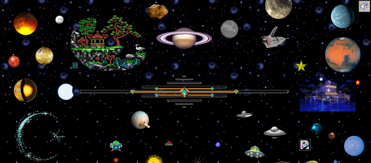
追逐趋势(Trend Chasing)
保持一点时髦是很让人高兴的。然而,花时间去追逐最新的流行语和交互设计风格,你最终会得到一个网站,它阅读起来就像是陈词滥调。如果可以的话,你要敢于不同。
It’s good to stay a little on-trend. However, spend your days chasing the latest buzzwords and interaction design styles, and you’ll end up with a site that reads a little bit like a cliché. Dare to be different, if you can.
交互设计——四种正确设计的方式(Interaction Design – Four Ways to Get it Right)
所以,以上便是我收藏的我最讨厌的交互设计错误。下面是一个便利的小列表,以提醒你如何用正确的方式设计!
1)目标驱动。不要为了添加效果而添加效果。不要选择某个调色板,导航栏,或者图标仅仅因为你认为它看起来不错。试试着眼在最终目标上。你想让你的网站达到什么目标?一旦你已经确定了那个目标,那么你很有可能就有了一个关于你应该使用什么样的交互设计的好主意。
2)记住要有人情味。如果你属于艺术型(我们不都是么),那你面对的诱惑是去创造美丽的东西,一些优秀的,一些有人从未做过的事。然而,如果没有人创建过和使用过,可能有一个很好的原因就是,它们确实没用。记住,网站的访客都是人类。你创造出旨在能直接吸引他们的东西。
3)保持一致性。是的,网站本身应该是很令人惊叹的。然而,网站也应该需要正常可用。你会有需要遵守某些设计惯例,以使网站易于浏览和理解。不要为了与众不同而违背常理。相反,接受你将需要实现一定的规则的事实,能帮助你的用户轻松地访问你的网站。
4)测试测试再测试。如果你发现任何疑问,就进行测试!有很多用户研究工具可以帮助你发现在产品中用户受困或者分心的地方。a/b测试,分析眼 动跟踪数据,或者是直接让你的客户,同事和朋友尝试你的新设计。没有什么比真正的反馈更有价值,并且几乎没有一个更好的方法能如此改进你的交互设想。
So, that was my collection of my most hated errors in interaction design. Here’s a handy little list, reminding you how to get it right!
Be goal-driven. Don’t add an effect for the sake of it. Don’t choose a color palette, navigation item, or icon simply because you think it looks good. Look at the end-goal instead. What do you want your site to achieve? Once you’ve identified that, then hopefully, you should have a good idea about what interaction design you should be using..
Remember the human touch. If you’re the artistic type (aren’t we all!) the temptation is to create something beautiful, something outstanding, something that has never been done before. However, if nobody has created and used it yet, there might be a very good reason for that…namely, it just doesn’t work. Remember, the visitors to websites are humans. Create something that is designed to appeal directly to them..
Keep it consistent. Yes, websites should be spectacular. However, they also need to be usable. There will be certain conventions that you’ll need to follow, in order to make the site easy to navigate and simple to understand. Don’t go against the grain for the sake of being different. Instead, accept that there are certain rules you will need to implement to help your users access your site with ease..
Test, test, test. If in doubt, test! There are plenty of user research tools to help you define where users get stuck or distracted. Do a/b tests, analyze eye-tracking data or simply ask your customers, colleagues, and friends to try out your new designs. There’s nothing more valuable than genuine feedback and there’s hardly a better way to improve your interaction ideas..
Want to Brush up on Your Skills?
If you’re keen to polish up on your interaction design skills, here are some great guides, full to the brim with useful information to help you:
Complete Beginner’s Guide to Interaction Design.
Interaction Design Basics from Usability.gov.
Interaction Design Tactics For Visual Designers.
If you think I’ve missed anything, or you’ve got a pet peeve related to interaction design that you want to share, just leave a comment below!
No related posts.
声明
本文95%为组合翻译,详见引用,5%为原创